
TL;DR

Get home appliances delivered free with Prime
- Fast, free delivery on millions of items
- Prime Video, Amazon Music and more included
- Member-only deals all year
Livingetc’s Style Pulse report for spring/summer 2027 identifies “texture near-match” as an emerging interior design approach. Designers pair materials within a shared color or texture family, using small differences in grain, sheen and tone rather than stark contrast; the report does not establish that the approach will replace color drenching across interiors.
Livingetc’s Style Pulse report for spring/summer 2027 identifies “texture near-match” as an emerging interiors direction: designers combine finishes that share a color or material family but differ subtly in grain, sheen or tone. The report frames the approach as a way to build depth through restrained contrasts, rather than as a proven replacement for color drenching across the industry.
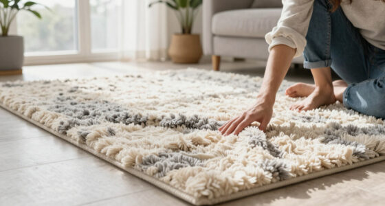
The report describes rooms where surfaces feel related without matching exactly: burr wood beside veined stone, suede alongside swirling veneer, or different wood grains used within one scheme. Variations become apparent on closer inspection, through texture, reflected light and small shifts in color. Livingetc characterizes the effect as quiet at first glance but layered over time.
In a tobacco-toned project, designer Katie Harbison used cotton velvet on the walls and mohair on the sofa and ottoman. The materials are close in color but belong to different fabric families. A bespoke artwork by Heath Wae, developed using physical samples from the room, carries the palette onto the wall while standing apart through its canvas profile.
At Colt Manor, designer Róisín Lafferty combined Viola Carnival and Breccia Pernice marble, whose plum, burgundy and peach tones sit with soft clay-pink walls. The report says the stone supplies pattern and visual interest, while the paint remains within the same tonal family. These are project examples, not evidence of how widespread the trend is.
Subtle Contrast Replaces Matching Sets
The approach uses variations in material to create visual depth while retaining a cohesive palette. Differences in texture, light reflection and finish can shape how a room appears without relying on strongly contrasting colors.
The report describes contrast among related surfaces rather than pairing obvious opposites. This may suit schemes that maintain a tonal palette while varying their materials. However, the forecast is an editorial trend assessment; it provides no market data showing that near-match finishes are displacing color drenching or other established approaches.
Products Worth Considering

LG C2 Series 65-Inch OLED evo 4K Smart TV (OLED65C2PUA, 2022)

Shark Navigator Lift-Away Upright Vacuum (NV360)

Philips Hue Bridge Pro Smart Lighting Hub
As an affiliate, we earn on qualifying purchases.
From Color Drenching to Material Layers
Color drenching uses one color across multiple surfaces to create a unified room. The examples in Livingetc’s report retain some of that tonal continuity, but shift attention toward differences between materials. Harbison’s tobacco-colored room, for instance, stays within one palette while using velvet and mohair to distinguish the walls from the seating.
The report contrasts near-matching with a familiar approach of pairing opposites, such as rough with smooth or matte with gloss. Designer Nicholas G. Potts, founder of Nicholas Potts Studio, links the search for more individual interiors to the prevalence of AI-generated imagery, which he says tends toward “safe” results. Nice Projects, the studio behind 40 Duke and Selfridges Members’ Club, points to people’s enjoyment of tactile materials. These are designers’ views on the trend, not independently measured causes.
“I love when materials almost match, but not quite.”
— Róisín Lafferty, interior designer
How Broad the Shift Will Be
The source is a seasonal trend forecast, not a survey of designers, a sales report or a consumer study. It does not quantify how many projects use near-match finishes, establish a baseline for comparison, or show that color drenching is declining. The headline’s suggestion that the look is “set to replace” drenching is stronger than the evidence described in the report.
It is also unclear how widely the approach will be adopted beyond the designers and projects cited, or whether it will become a lasting preference rather than a style direction for SS27. Livingetc offers examples and expert opinions, but no adoption figures or forecast methodology in the supplied material.
What the SS27 Forecast Can Show
The report presents near-match textures as a direction to watch for spring/summer 2027. Its examples point to practical choices—keeping a shared tonal palette while varying fabric, stone, wood grain or finish—but the supplied material does not name a scheduled industry decision, launch or follow-up data release.
Whether the trend gains wider traction will become clearer through future design projects and reporting on the season. For now, the supported takeaway is narrower: Livingetc’s forecast identifies related, non-identical materials as one approach designers are exploring, not a confirmed industry-wide change.
Key Questions
What does “texture near-match” mean?
It means combining materials that share a color or textural family but are not identical. Differences may show up in grain, sheen, pattern or tone.
Is near-match texture confirmed to replace color drenching in 2027?
No. Livingetc’s report identifies it as an emerging SS27 direction, but does not provide evidence that it will replace color drenching across the interiors industry.
How does the trend differ from using contrasting finishes?
Instead of pairing clear opposites, such as rough and smooth, near-match schemes keep materials related and rely on subtle differences in surface, light and tone.
Which materials appear in the report’s examples?
Examples include cotton velvet and mohair, different marbles, clay-pink paint, burr wood, veined stone, suede and veneer.
Source: livingetc.com