
TL;DR

Get home appliances delivered free — and shop member deals
- Fast, free delivery on millions of items
- Access to Prime Big Deal Days deals on October 6–7
- Prime Video, Amazon Music and more included
Designers use a specific approach that considers natural light and room function to select paint colors that look great during day and night. This method helps create dynamic, harmonious spaces. The technique remains largely under the radar for most homeowners.
Interior designers are increasingly relying on a little-known technique that considers how natural light and room function influence paint color choices, ensuring spaces look appealing both during the day and at night. This approach enhances the overall ambiance and functionality of a home, making it a valuable insight for homeowners and designers alike.
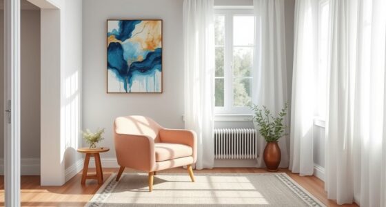
According to recent insights from Homes & Gardens and professional designers, the secret involves selecting paint colors based on the room’s natural light exposure and its primary use, such as morning or evening activities. For rooms used mainly in the morning, designers favor light neutrals, warm whites, and soft hues that reflect daylight, creating a welcoming atmosphere. Conversely, evening spaces are often painted with darker, cocooning tones to foster intimacy and comfort after sunset.
Designers like Jessica Hobson emphasize the importance of dual palettes—light for daytime and darker for night—to create a home that feels dynamic and well-balanced across the hours. They also consider room orientation, existing elements, and the natural shift in light throughout the day to select colors that adapt and maintain visual harmony. This method is rooted in understanding how light reveals undertones and how different materials influence perceived color.
While this technique is gaining recognition among professionals, it remains underutilized by many homeowners, who often choose colors based on aesthetics alone without considering natural light and room function. The result is often a mismatch between the intended mood and the actual appearance of paint at different times.
Why This Color Selection Method Transforms Home Design
This approach allows homeowners to create spaces that are visually appealing and functional throughout the day. By aligning paint colors with natural light and room use, homes feel more harmonious, inviting, and adaptable. It also reduces the need for frequent repainting or decor adjustments, making interior design more sustainable and cost-effective.
Understanding this secret can help homeowners avoid common pitfalls, such as choosing colors that look dull in daylight or overly vibrant at night, and instead craft environments that feel balanced and intentional. As a result, this method enhances overall well-being by fostering spaces that support daily routines and moods.
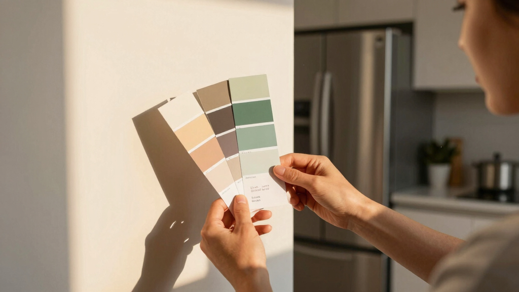
paint color samples for natural light
As an affiliate, we earn on qualifying purchases.
As an affiliate, we earn on qualifying purchases.
Evolution of Color Strategies in Interior Design
Traditionally, paint colors were selected based on personal preference or trends, often without considering how natural light impacts color perception. However, recent shifts in interior design emphasize the importance of light-aware palettes, especially as open-plan and multi-use spaces become more common. Designers have started to recognize that the same color can look dramatically different depending on the time of day and the room’s orientation.
This awareness aligns with broader trends toward creating more personalized, functional homes that adapt to daily routines. The practice of matching paint colors to natural light and room activity is a response to these evolving needs, supported by insights from leading interior design sources like Homes & Gardens and professionals in the field.
While the concept has been discussed among designers, it remains less known among the general public, partly due to the complexity of understanding light behavior and undertones. Nonetheless, its growing popularity signals a move toward more thoughtful, light-sensitive color planning in home interiors.
“You need those dark, dramatic spaces in a home that create special moments and give a big impact, as well as the light and airy spaces that seem more effortless and seamless.”
— Jessica Hobson
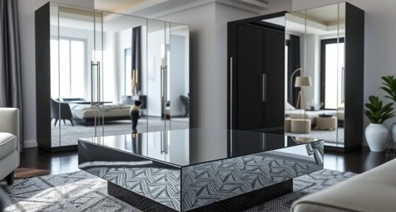
light and dark room paint palettes
As an affiliate, we earn on qualifying purchases.
As an affiliate, we earn on qualifying purchases.
Unanswered Questions About Light-Responsive Color Choices
While the method is gaining traction among professionals, it is not yet clear how widely homeowners are adopting this approach without expert guidance. There is also limited data on how specific colors perform across different climates and room orientations, which can influence the effectiveness of this technique. Further research is needed to establish standardized guidelines for implementing these strategies in diverse home environments.
interior paint color guide for day and night
As an affiliate, we earn on qualifying purchases.
As an affiliate, we earn on qualifying purchases.
Future Trends in Light-Adaptive Interior Color Planning
Expect more interior designers to incorporate light-sensitive color strategies into their standard practices, possibly supported by new tools or apps that analyze natural light patterns. Homeowners may become more aware of the importance of room orientation and light behavior when selecting colors, leading to more personalized and adaptable interiors. Ongoing education and research will likely refine these techniques, making them more accessible and reliable for broader use.
As an affiliate, we earn on qualifying purchases.
Key Questions
How do I determine the best paint colors for my rooms based on natural light?
Observe how sunlight enters your rooms at different times of day and note the existing colors and materials. Choose light, neutral, or soft hues for rooms with abundant daylight, and darker, cocooning tones for spaces used mainly in the evening. Consulting a designer can help tailor these choices to your specific space.
Can this method be applied to all types of rooms?
Yes, but it is most effective when considering the room’s primary use and orientation. Living rooms, kitchens, and bedrooms can benefit from tailored palettes that adapt to natural light, enhancing comfort and ambiance.
Are there specific colors that work best for daytime versus nighttime?
Light neutrals, warm whites, and soft blues are ideal for daytime, while deep greens, blues, or charcoal tones create cozy atmospheres at night. The choice depends on the room’s function and personal preference.
Is this approach suitable for DIY home painting projects?
While homeowners can apply these principles, understanding how natural light affects color perception can be complex. Consulting with a professional or using color analysis tools can improve results.
Source: Homes & Gardens
Fall yard work Picks
leaf blowers
As an affiliate, we earn on qualifying purchases.