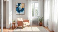
To make small spaces feel bigger, choose smaller, subtle patterns that don’t overwhelm the room. Balance bold prints with neutral tones and use vertical lines to create height or horizontal lines to widen the space. Incorporate prints in accessories and strategically place them near windows or light sources for maximum impact. Mixing patterns carefully keeps visual interest without clutter. If you want expert tips on mastering pattern harmony, keep exploring how to style your space effectively.
Key Takeaways
- Choose small, subtle patterns to prevent overwhelming small spaces and create a cohesive look.
- Balance bold prints with neutral tones like beige or gray for visual harmony and calmness.
- Use vertical lines to make rooms appear taller and horizontal lines to enhance width.
- Incorporate prints through accessories like pillows and vases for easy pattern mixing and personalization.
- Limit pattern variety to 3-4 with a consistent color palette for a unified, spacious feel.
Choosing the Right Patterns for Small Spaces

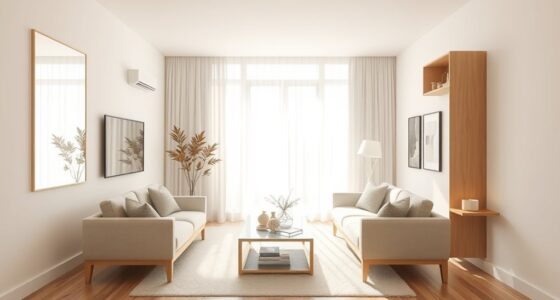
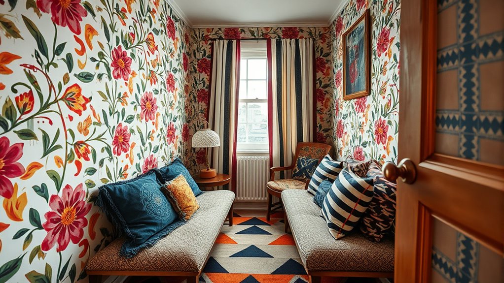
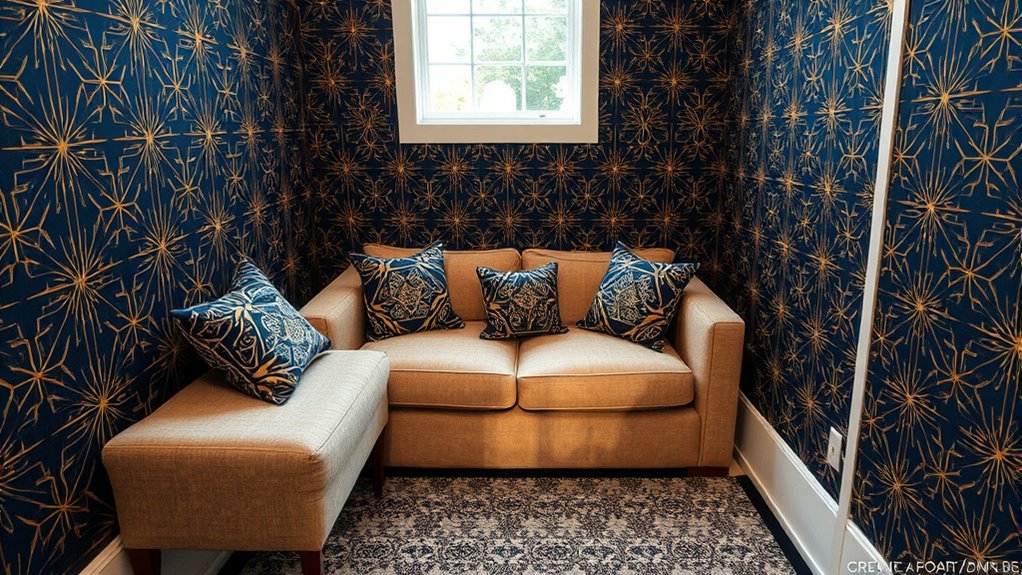
Have you ever wondered how to make a small space feel larger and more inviting? Choosing the right patterns plays a key role. Opt for smaller patterns or subtle prints, which create a sense of continuity and prevent the room from feeling cluttered. Large, bold patterns can overwhelm a small space, making it feel cramped. Instead, focus on pattern scale—using smaller, more delicate prints helps the eye move smoothly across the room. Contrast balancing is also essential; pair patterned elements with neutral tones to avoid visual overload. For example, a patterned throw pillow against a plain sofa creates interest without overpowering the space. Incorporating vintage decor and rustic elements can add charm without overwhelming a cozy room. Understanding design principles such as scale and contrast can further enhance your small space. By carefully selecting pattern scale and balancing contrast, you’ll craft a cozy yet spacious feel that maximizes your small room’s potential.
Balancing Bold Prints With Neutral Tones

Balancing bold prints with neutral tones creates a harmonious and sophisticated look in any space. To avoid pattern clash, pair vibrant prints with neutral shades like beige, gray, or white. This contrast allows the bold pattern to stand out without overwhelming the room. Focus on color coordination by selecting neutral tones that complement the dominant colors in your prints. For example, if your print features blue and yellow, incorporate subtle accents of these hues in your neutral accessories. Keep the overall palette simple to maintain balance and avoid visual chaos. By anchoring bold patterns with calming neutrals, you create a space that feels lively yet cohesive, enhancing your small space without making it feel cluttered or chaotic. Additionally, being mindful of support hours at nearby entertainment venues can help you plan visits during less crowded times, ensuring a more relaxed and enjoyable experience. Incorporating a dog’s name can also add a cozy, welcoming touch that complements your decor style. Understanding pattern mixing techniques can further help you create a balanced and visually appealing environment. Recognizing retail hours for local stores can also assist in planning your shopping trips more effectively.
Using Vertical and Horizontal Lines to Create Illusions of Space
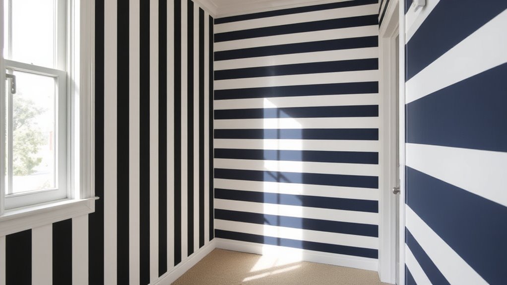
Vertical lines can make your space feel taller by drawing the eye upward, while horizontal lines can make a room seem wider by emphasizing its breadth. You can use these patterns strategically to enhance the proportions of your room or outfit. Understanding how to apply vertical and horizontal lines helps you create a balanced, more spacious look.
Vertical Lines Enhance Height
Did you know that vertical lines can instantly make you appear taller and more elongated? They draw the eye upward, creating a sleek, vertical flow that enhances your height. To maximize this effect, focus on color contrast—pair dark vertical stripes with lighter backgrounds for sharpness. Also, consider pattern scale; narrow, evenly spaced lines work best for a taller silhouette. Here’s a visual to help:
| Pattern Type | Effect |
|---|---|
| Thin, dark vertical lines | Elongates and slims |
| Bold, wide stripes | Adds height without bulk |
| Small vertical prints | Creates subtle lengthening |
| Large, spaced-out lines | Can break the illusion |
Choosing the right vertical pattern helps you appear taller and more graceful in tight spaces.
Horizontal Lines Expand Width
Horizontal lines can make a space feel wider and more open when used thoughtfully alongside vertical and horizontal patterns. To maximize this effect, select fabrics with smooth textures that reflect light, enhancing the sense of spaciousness. Keep your pattern scale balanced; large horizontal stripes can create a bold, expanding illusion, while narrower lines offer a subtler increase in perceived width. Avoid overly busy or small-scale prints, which may clutter the space, and instead opt for clean, simple lines. Combining horizontal lines with minimalistic textures prevents visual overload while emphasizing openness. Remember, the key is to use these patterns strategically, creating a harmonious flow that visually broadens your room without overwhelming it. With thoughtful fabric choices and pattern scale, you transform tight quarters into an airy, inviting space.
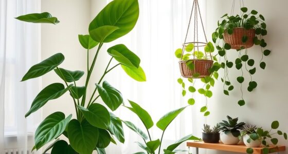
Incorporating Prints in Small Accessories and Decor
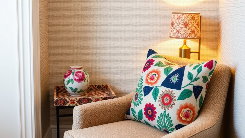
Ever wondered how a simple print can transform small accessories and decor into eye-catching statement pieces? It’s all about choosing the right pattern scale and maintaining good color coordination. For small items like pillows, vases, or picture frames, opt for prints with a manageable pattern scale—neither too tiny nor overwhelming. This ensures the print adds visual interest without cluttering the space. Coordinating colors is key; select hues that complement your existing palette to create harmony. A well-placed print on a lampshade or tray can anchor a room’s style subtly but effectively. Remember, small accessories are perfect for experimenting with prints, so don’t be afraid to mix patterns in similar color families. This approach keeps your decor lively yet balanced, making your space feel thoughtfully curated. Additionally, understanding pattern scale helps in selecting prints that enhance rather than overpower your small decor items. Incorporating popular juice brands into your lifestyle can also inspire fresh ideas in decorating your kitchen or bar area, adding a touch of vibrancy and health-conscious appeal. Exploring different print styles can further elevate your decorating game by creating visual interest and depth. For instance, selecting prints based on color coordination principles ensures a cohesive look that ties all elements together seamlessly.
Combining Patterns Without Overwhelming the Room

Once you’ve chosen the right prints for your accessories, the next step is blending multiple patterns within a space without creating visual chaos. Focus on color coordination to guarantee each pattern complements the others, preventing the room from feeling overwhelming. Pay attention to pattern scale; mixing large and small prints creates visual interest while maintaining balance. To avoid clutter, stick to a cohesive color palette and vary pattern sizes strategically. Incorporating limits on pattern variety can also encourage resourcefulness and help maintain harmony. Additionally, selecting aesthetic hooks and wall organization stylish solutions can help manage visual clutter and create a balanced environment. Incorporating a balanced pattern distribution ensures that no single pattern dominates, fostering a cohesive look. Using a dominant pattern with smaller accents helps create harmony and focal points within the space. – Use a dominant pattern with smaller accents to create harmony – Pair bold, large-scale prints with subtle, smaller patterns for contrast – Limit the number of different patterns to three or four to keep the space cohesive. Recognizing the importance of copyright and affiliate disclosures can also promote transparency in your decorating choices, especially when sharing your ideas online.
Strategic Placement of Prints to Enhance Light and Depth
Strategic placement of prints can considerably enhance the light and depth in a room by guiding the eye and creating visual interest. Using high color contrast in your prints draws attention to specific areas, making them feel more vibrant and lively. For example, placing a bold, contrasting print on a focal wall can make the space appear larger and more dynamic. Additionally, adjusting pattern scale plays a key role; larger patterns can add depth and anchor a room, while smaller prints help bounce light around, brightening tight spaces. Position prints thoughtfully—near windows or light sources—to maximize their impact. This intentional placement creates a sense of dimension and openness, making your room feel more expansive despite limited space.
Personalizing Your Space With Unique Pattern Mixes

Mixing different patterns is a powerful way to express your personality and create a dynamic, personalized space. To master pattern layering, start by choosing a unifying theme or color palette. This helps guarantee your mixes look intentional and cohesive. Use color coordination to balance bold prints with more subdued ones, so your space feels lively yet harmonious. Experiment with scale—pair large patterns with smaller ones to add depth without overwhelming. Incorporating visual harmony by paying attention to pattern size and placement ensures a balanced and appealing look. Additionally, considering store hours when planning your decorating trips can help you visit your favorite retailers like Ulta Beauty or Sephora at optimal times to pick out new patterns and prints. Understanding personality traits can also guide your choices in pattern mixing, helping you create a space that truly reflects your individual style. Being aware of color psychology can further enhance your pattern selections by evoking specific moods or feelings in your space. Recognizing regional design influences can also inspire your pattern choices, adding a unique cultural touch to your decor.
Frequently Asked Questions
How Can I Mix Patterns Without Clashing Visually?
You can mix patterns without clashing by focusing on scale balance and pattern hierarchy. Keep one pattern bold and prominent while pairing it with smaller, subtler prints. Use similar color palettes to create harmony, and vary the scale of patterns—large with small—to avoid visual chaos. This approach helps your outfit look cohesive, even in tight spaces, making your pattern mix appear intentional and stylish.
What Are the Best Color Combinations for Small Print Accents?
Think outside the box to find the best color combinations for small print accents. You want a strong color contrast that highlights the details without overwhelming the space. Pair light shades like soft pinks or blues with darker hues such as navy or charcoal. Keep the pattern scale tiny to maintain balance. When you strike this harmony, your accents will pop beautifully without clashing, proving that good things come in small packages.
Which Patterns Make a Room Appear Larger Instantly?
You can make a room appear larger instantly by choosing patterns with a small scale, as they avoid overwhelming the space. Opt for fabrics with smooth, flat textures rather than bulky or heavily textured ones. These choices help create an illusion of openness and lightness. Pairing small-scale patterns with sleek, simple textures enhances the sense of spaciousness, making your room feel airy and expansive.
How Do I Choose Prints for Different Seasons or Moods?
Did you know that seasonal fabric textures can boost your mood by 40%? When choosing prints for different seasons or moods, pick patterns that reflect the time of year and your emotional state. Use warm, cozy textures and soothing colors in winter to create comfort, and opt for light, vibrant patterns in summer to energize. Let your mood guide your print choices, and you’ll feel more connected to your space year-round.
Can Patterns Help Improve Room Acoustics or Sound Quality?
Patterns can indeed improve room acoustics by enhancing sound absorption and creating better acoustic quality. You can choose textured or patterned fabrics, wall coverings, or rugs that break up sound waves and reduce echoes. By strategically incorporating patterns, you enhance acoustic enhancement, making your space more comfortable and functional. Just be mindful of the placement and scale of the patterns to maximize their impact on sound absorption.
Conclusion
Remember, a picture is worth a thousand words, so choose your patterns wisely. When you mix prints thoughtfully and place them strategically, you can transform a tiny space into a stylish haven. Don’t be afraid to experiment and showcase your personality through your decor. With patience and a keen eye, your small quarters can feel spacious and inviting. After all, small spaces may be tight, but your style can be boundless.